

The soft, warm glow of bastard amber
Or: why we should rename golden hour to honor our fallen color comrade


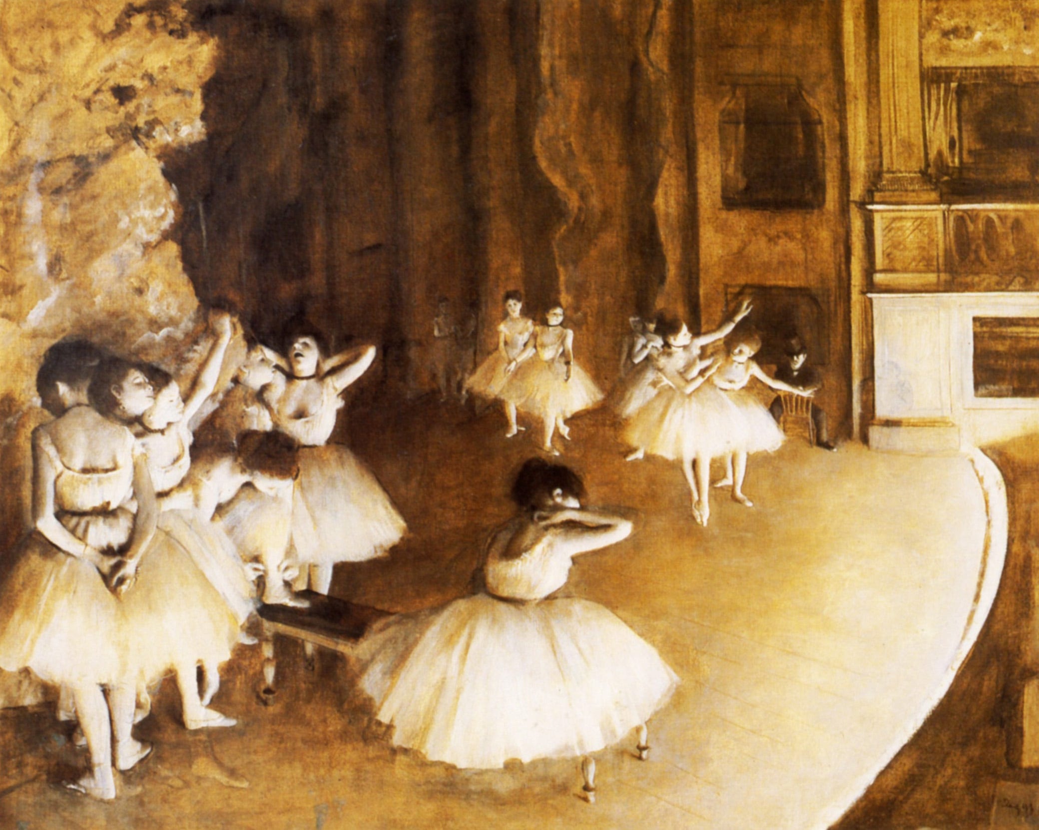
Before the dour blue tones took over cinematography, before we could click a button and change the color of a scene, there was a product called “bastard amber.” It was a plastic-based gel disk that could be placed over a lightbulb, creating a yellowish cast to the light. It was a dimensional color, made with all the primary hues, which gave everything it fell upon a certain depth and warmth. It was a pre-Instagram filter—that is to say, an actual filter, one that absorbed some of the light that tried to pass through. The rays that made it beyond the gel were then bounced back into the eyes of the viewers as a golden brown, similar to firelight but not quite as bright.
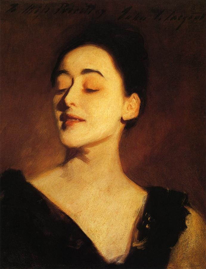
I first started reading about bastard amber years ago, when I was researching color “moments” for a New York Times magazine assignment. It was a short piece, one that ran alongside a longer feature by another writer (Bruce Falconer, who is great, by the way). I was trying to understand how we got to such a strange place with our movie coloring, wondering why so many of our 21st century blockbusters looked the same, why films from earlier periods just looked better to me. The answer is complicated, but it has to do with the ease of digital colorization, the terrible cheapness of studio executives, and the general aesthetic deterioration of Hollywood. Why bother lighting with physical filters when you can simply color correct in post production? Why monkey around with bastard gels and plastic disks when you can get much more consistent results on the computer?

Bastard amber is a lost color—killed by tech, like so many things—but it was never all that well known anyway. It’s an inside baseball color, more of a tool or a product than a familiar, named color like turquoise or chocolate or maroon. But I find its backstory enchanting, brushed as it is with the allure of old Hollywood glamor. Plus, I like obscure hues, and there are few things I respect more than physical, handworked, textured, human craft. Admittedly, I have used app-generated filters to change my digital photos before posting them to social media, thus engaging in the same kind of mindless filtering that I’m railing against, but I don’t do that anymore. I stopped using filters for many reasons—laziness, desire to showcase my life more honestly, laziness—but nestled somewhere among them is an aesthetic objection. Filters are just too consistent, too smooth, too good. Even when they have texture, it is produced and uniform, the fake lens flares always appearing in exactly the same position. I like a little bastard in my sepia tones, a little smear of sunscreen over my iPhone lens. I still enjoy my digital life and its proliferation of lovely images and easily accessible art, but I feel such a stronger affinity to the realm of objects, the place of skin and bone, the thing itself.

While I very much doubt that bastard amber would make all faces tones look prettier—people aren’t all the same “flesh tone” and the “technicolor tan” was probably only really good for white folks—I do think there’s something universally appealing about amber itself. Humans are drawn to gold, rather like moths to a yellowish flame. We’re comforted by the image of a contained blaze, be it as small as a tealight or as large as a granite-ringed beach bonfire. We enjoy the thing itself, too, but real fire brings risks while faux-fire is safe. Materials like amber, citrine, topaz, and gold function as both symbols of the thing (fire, warmth, sunlight) and the thing itself (object, stone, metal, treasure). A chunk of amber isn’t just resin; it’s a symbol for our ancient, primal desire for heat and survival itself. And unlike gold, you can gaze through amber, following the light from one side to another. This makes it inviting, as does its ability to become negatively charged through friction. It attracts fuzz and hair to its soft surface, pulling the world inward toward its light.
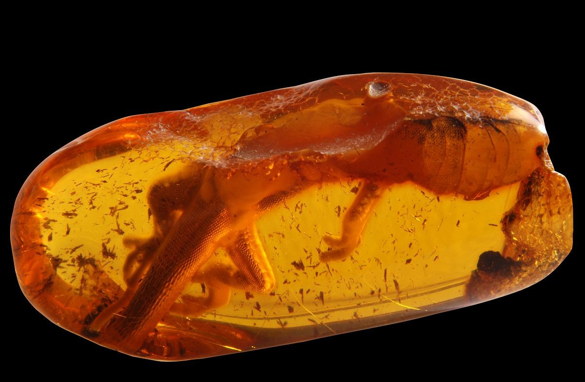
People have been using amber for physical adornment for at least 5,000 years. It’s easy to work (it rates 2 or 3 on the Mohs scale) and abundantly available in deposits around the globe. Our various names for amber tend to emphasize its reflective and refractive qualities, as well as its easily charged nature:
The standard Greek word for amber was elektron. The derivation of this word is uncertain, although scholars have suggested that it might have connections with helko, meaning “to draw or attract,” or with aleko, meaning “to ward off evil.” The word is certainly associated with elektor, used in the Iliad to mean “the beaming sun,” and is most likely derived from an Indo-European verb with the root meanings “brilliant” or “to shine.” This quality of beaming, or reflecting the sun, is also suggested by the Germanic word for amber, glaes or glese, recorded in some ancient Latin sources as glaesum, the same word used for glass in this period. The Indo-Germanic root for this word, ghel, means “lustrous, shimmering, or bright” and gives us words such as glisten, glitter, glow, and yellow in English. The current German word for amber, going back to thirteenth-century Middle Low German, is similarly evocative: Bernstein means “burning stone.” (Source: Getty Museum)
Interestingly, the myths around amber tend to emphasize not its molten warmth but its wetness. In Greek mythology, amber is made from the tears of mourning sisters, crying for their dead brother (who dared try to fly the sun’s chariot). After finding their sibling’s corpse on a riverbed, the women began to despair, but the gods took mercy on them (I guess?) and turned them into poplar trees. Their tears fell upon the sand and transformed into amber. According to Polish legend, amber comes from a magical underwater castle, where Queen Jurata lived in peace, until she fell in love with a mortal and was punished by her parents. They blasted apart her lovely amber home with a bolt of lighting. Waves carried the fragments of her life back to the shore, where Baltic fishermen still find them today.
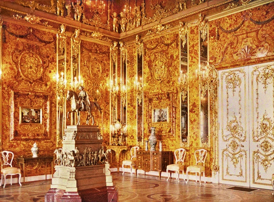
I tend to forget how remarkable amber really is, probably because it can be purchased so cheaply. It’s a bit like turquoise, in that way. It’s undervalued in American culture because it is very easily mimicked. But there are plenty of places where amber is respected, where people remember its primal charms. Someday, I’d like to visit the Museum of Amber in Poland (there’s also amber museums in both the Dominican Republic and Denmark). There’s something clarifying about places devoted to one material—they let you see both the breadth of its natural variations and depth of our ingenuity. Amber can be carved into playful netsukes or shaped into beads or polished into panels. We can turn it into ewers and spiders and kissing couples. It’s beautiful, no matter how you cut it.

But like all browns, amber isn’t frequently listed as a favorite color. I suspect this is because brown doesn’t really feel like a true color—it’s not part of the rainbow, after all. In some ways, it seems like a quality, a texture, not a function of light. Bastard amber (somewhat) upends this. This salmon-golden-yellowish-brown is a tone of light, one created by interference. Interference is one of the fifteen “causes of color” identified by researcher and writer Kurt Nassau. In contrast to colors caused by incandescence (flames, lamps) and colors created by organic compounds (dyes, biological colorations), this color comes from a material that messes with light, which places it in the same broad category as “geometrical and physical objects” (which also includes scattered light, i.e. blue skies, and refracted light, like rainbows). Bastard amber isn’t just a bastard because it’s hard to create—supposedly, that’s how it got its name, though the exclamation of an exasperated electrician—it’s a bastard because it’s not quite amber. It has no relationship to the gemstone, no real connection to tree sap or tumbled rocks. It’s man-made, a color that resembles the output of a sodium lamp (dialed up a few notches). It’s a color created to shine upon something, to blend into a scene, to improve a face without interfering with its expressions. It’s a fleeting effect, one that lasts only as long as the light is switched on. Without the beam of light flowing through the plastic disk, it vanishes.
Perhaps this is why I like amber so much: it’s a brown that resides in the ether, like all the other colors of the rainbow. Could amber ever be matte, ever be flat, ever be as seemingly static as soil or chocolate or bark? I don’t think it could be. I think amber is, like glistening droplets of sap bleeding from a ponderosa pine, a hue that requires transparency. It can never be saturated—one must always be able to look through it, at least a little. Lacquers can be amber, watercolors can depict amber brilliantly, and glass can, of course, be amber-toned. Silk, maybe, could be amber, but wool cannot.
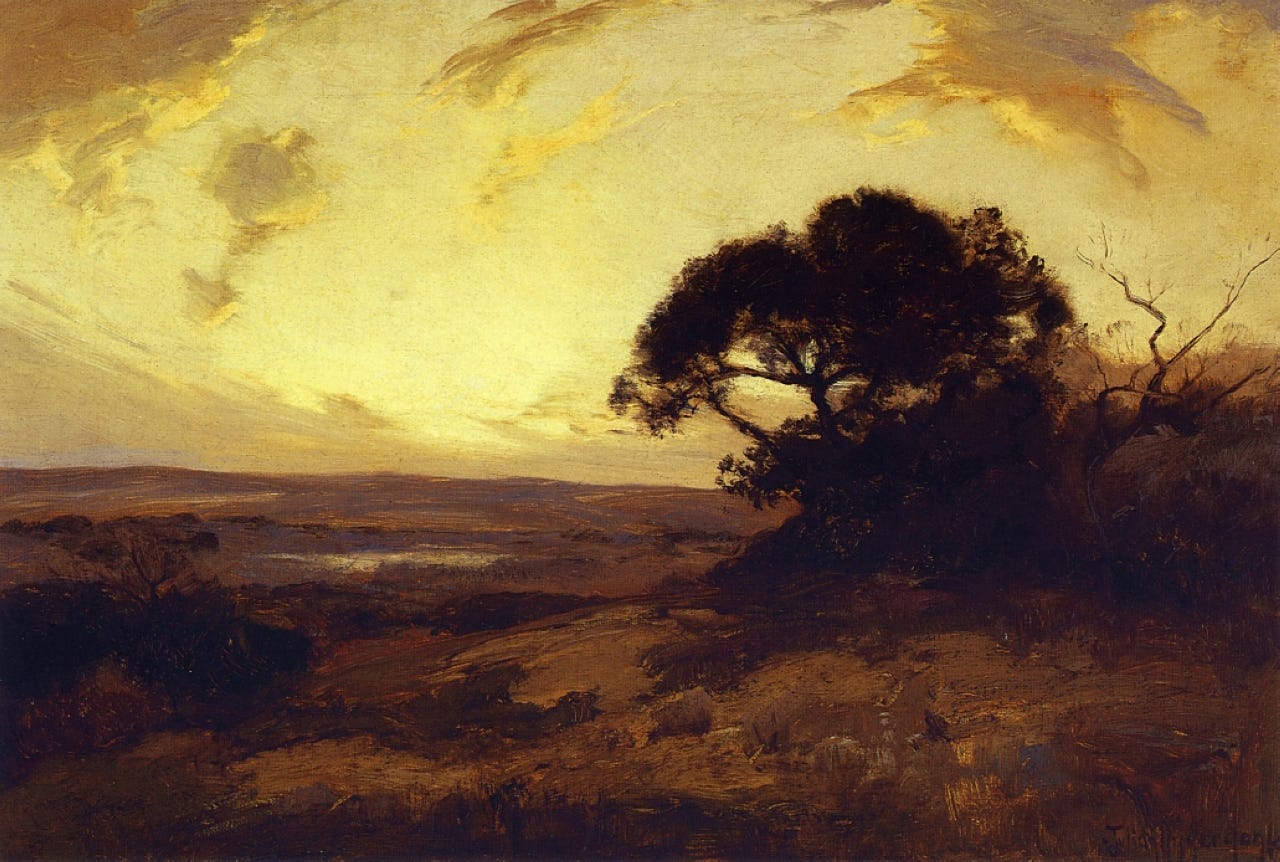
I’m currently reading The Aesthetic Brain by Anjan Chatterjee, a somewhat dense nonfiction book about our very human response to beauty, where it resides within our skulls, and how it got there (from an evolutionary perspective, I mean). In one chapter, Chatterjee posits that our love for certain landscapes comes from their similarities to the African savannah, that we have hardwired into our brains an image of the world from which we all came, and that we know, on a subconscious level, that home is shaped like a vast expanse, dotted with trees, fed by rivers. It seems a bit far-fetched to me, the idea that we’re craving the scene where we first became us, but maybe there’s something to it. Because I think, deep down, we don’t just like watching amber-lit scenes because they make pale people look sexier. I think we crave the warmth and safety of light produced by burning wood. On some level, I think we all worship the tamed flame. We recognize the sacrifice Prometheus made for us.
Film school grad here, and I can promise I learned more from you about bastard amber gels than I did at UCLA-- that's why I look forward to your Color Stories!
I love the idea of a color that can't be saturated. Are there others in this class (a "hue that requires transparency")? What happens if you push amber to the brink, and attempt to saturate it, what do you get?
I think you're onto something with "the tamed flame" in terms of capturing amber's allure. Is that why humans are drawn to all sorts of similar objects and objets d'art? From an evolutionary perspective, I always wonder what possesses us to gawk at the beauty of fireworks-- doesn't seem to serve a purpose. If anything, it seems like a bad idea. And then you show up with a book called "The Aesthetic Brain," and I will bet you dollars to donuts the answer is in there, so I'm begging you please tell me when you get to that part : )
Exquisite writing, thanks Katy!
PS. Favorite scent? Bastard ambergris
Incredibly beautiful. Just ordered Anjan Chatterjee's book. Bastard amber feels like the color of my Hindu childhood, now I'm curious about the connections.