

The bad vibes of lemon chiffon.
Art I like, a color I don't.

Was it coincidence or was it nominative destiny? Either way, his name was Henry Baker, and this was his legacy: a fluffy, lighter-than-light, pale yellow cake. The year was 1927 and Baker had, according to the New York Times, “abandoned a wife and child in Ohio to make a new life in Hollywood,” which I suppose wasn’t going that well, considering how much time he had to “fiddle obsessively” in his California kitchen. Eventually, he settled on a recipe that was a huge hit with his neighbors and friends, and Baker sold his makes from the front porch for $2 a pop (equivalent to around $35 in today’s cash). He was able to charge a premium because no one else could make a cake quite like that, and for decades, he held tight to the secret of chiffon.
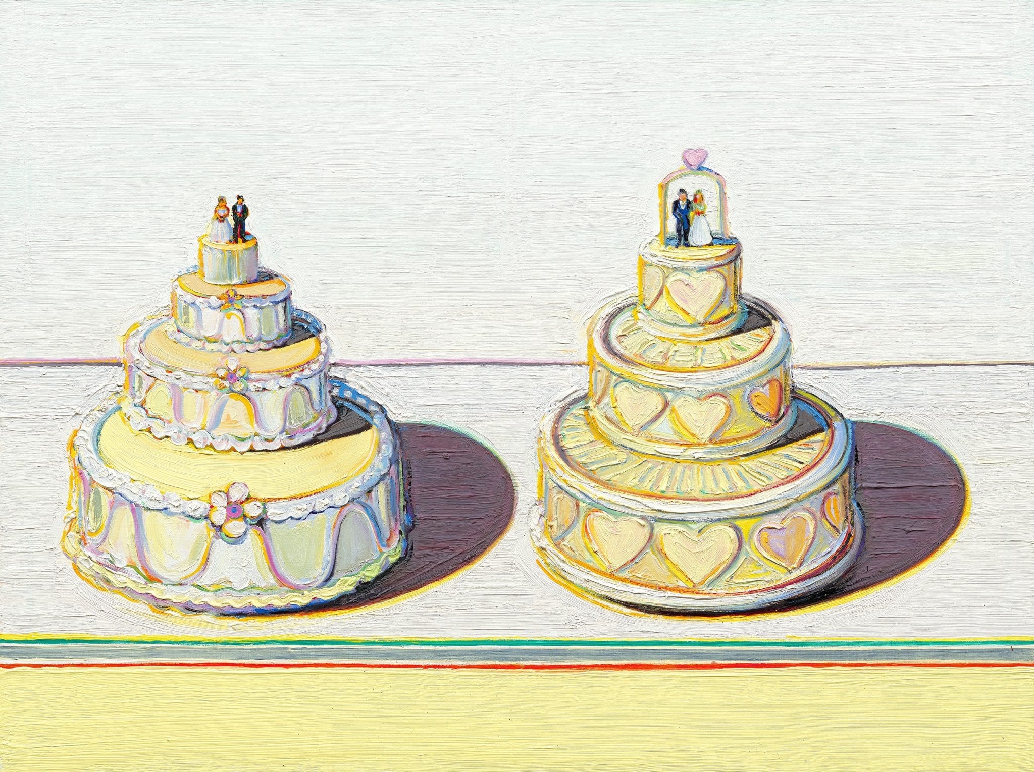
It was General Mills that finally cracked the baker. In 1947, he sold his recipe to the company, and they told the general public in a Betty Crocker pamphlet. Chiffon was hailed as the “first new cake in 100 years” and naturally, it became a must-make for many women. Soon enough, housewives across the country were being begged to pull out the KitchenAid and whip up their own butterless bake. Although this is a bit besides the point for a Color Story, I want to quote Bee Wilson’s Consider the Fork here, since it nicely encapsulates how technology, food trends, and domestic labor intertwine:
Another problem with the labor-saving devices aimed at women is that they have always come along at the same time as a rise in culinary expectations, so the net result was a cook who was more exhausted than ever… It would not be until the electric mixers of the twentieth century that beating eggs became radically easier. The early patent eggbeaters, by contrast, brought only the illusion of ease, coupled with a sense that producing perfectly beaten eggs was something that women ought to do, and a woman in possession of a Dover felt obliged to make fancy cakes with it. The popularity of these whirligigs also corresponded to a new vogue for angel food cakes, which necessitated huge volumes of eggs to be beaten, the whites and the yolks separately. So far from halving a woman’s work, this latest, greatest mechanism could actually multiply it.
I’ve never baked a chiffon, so I can’t attest to how much labor it requires. It certainly sounds fussy to me, but again: I’m a just weeknight mom cook, in the kitchen out of necessity. I occasionally bake from boxed mixes when my daughter wants dessert. (My own cravings tend salty.) For all these reasons, my lemon chiffon isn’t a cake. It’s a color.
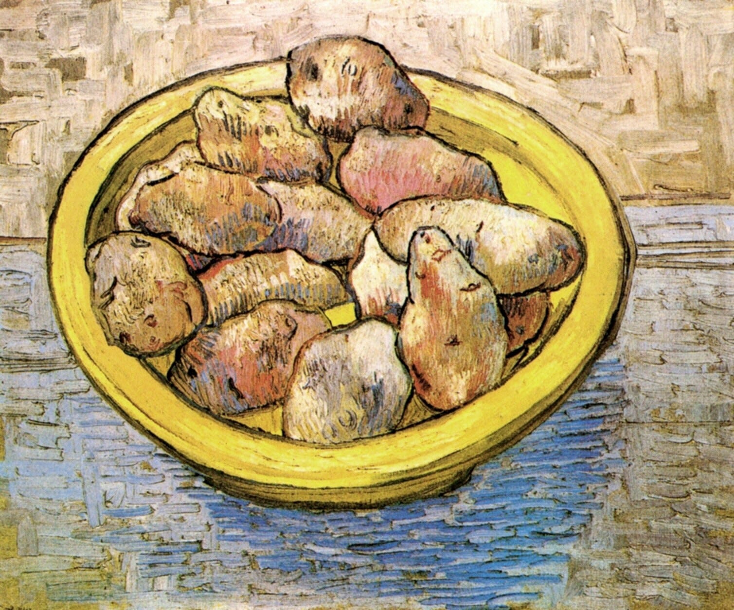
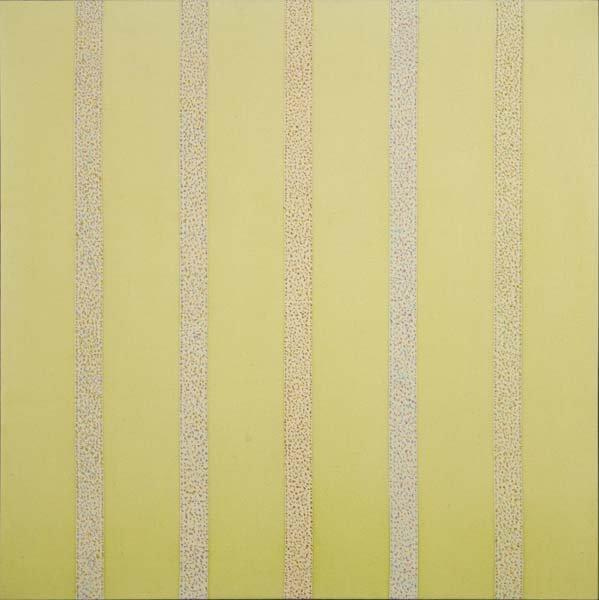
What shade is it, exactly? I think it’s close to butter yellow, though with less cream in the recipe. It’s not quite as bright as saffron, nor is it as pigmented as the standard lemon yellow, but it feels closer to these hues than it does to ivory. Butter may be an off-white, but lemon chiffon is not. It’s a true, sunny yellow, a childish, springtime color. It’s decadent in the homespun way of an upscale country bed and breakfast. It brings to mind fluffy baby chicks and worn flannel blankets, grandma’s quilts and brunch with hollandaise. Unlike champagne yellow, which glimmers and glints with late night secrets and wedding guest debauchery, lemon chiffon is a daytime color, a churchgoers hue. It’s a bit cloying, and rather retro. I don’t think I like it.
On one hand, lemon chiffon is pretty, and I like pretty things. On the other, lemon chiffon is pastel and passé, too sweet for my teeth. I do like daffodils and farmhouse decor, but I don’t really enjoy Easter and I get squirrely around too much nostalgia. I suppose it’s just one of those colors that I like in nature but wouldn’t want to wear. I certainly wouldn’t want this color on the walls of my house—I’ve made that mistake before.
Lemon chiffon, light and bright, looked good on the paint swatch. And it looked nice when I began painting. I was in high school and it was the first time I had ever undergone a project like that. It wasn’t until the paint dried that I began to understand my mistake. What looked creamy and soft as a sample was searing, overwhelming, like staring directly at a sickly February sun. I felt like the narrator from The Yellow Wallpaper, creeping, creeping around my own bedroom, watched always by that too-vivid hue. It wasn’t any better at night; in fact, the yellow became worse then.
“The color is repellent, almost revolting: a smoldering unclean yellow, strangely faded by the slow-turning sunlight." - Charlotte Perkins Gilman, The Yellow Wallpaper
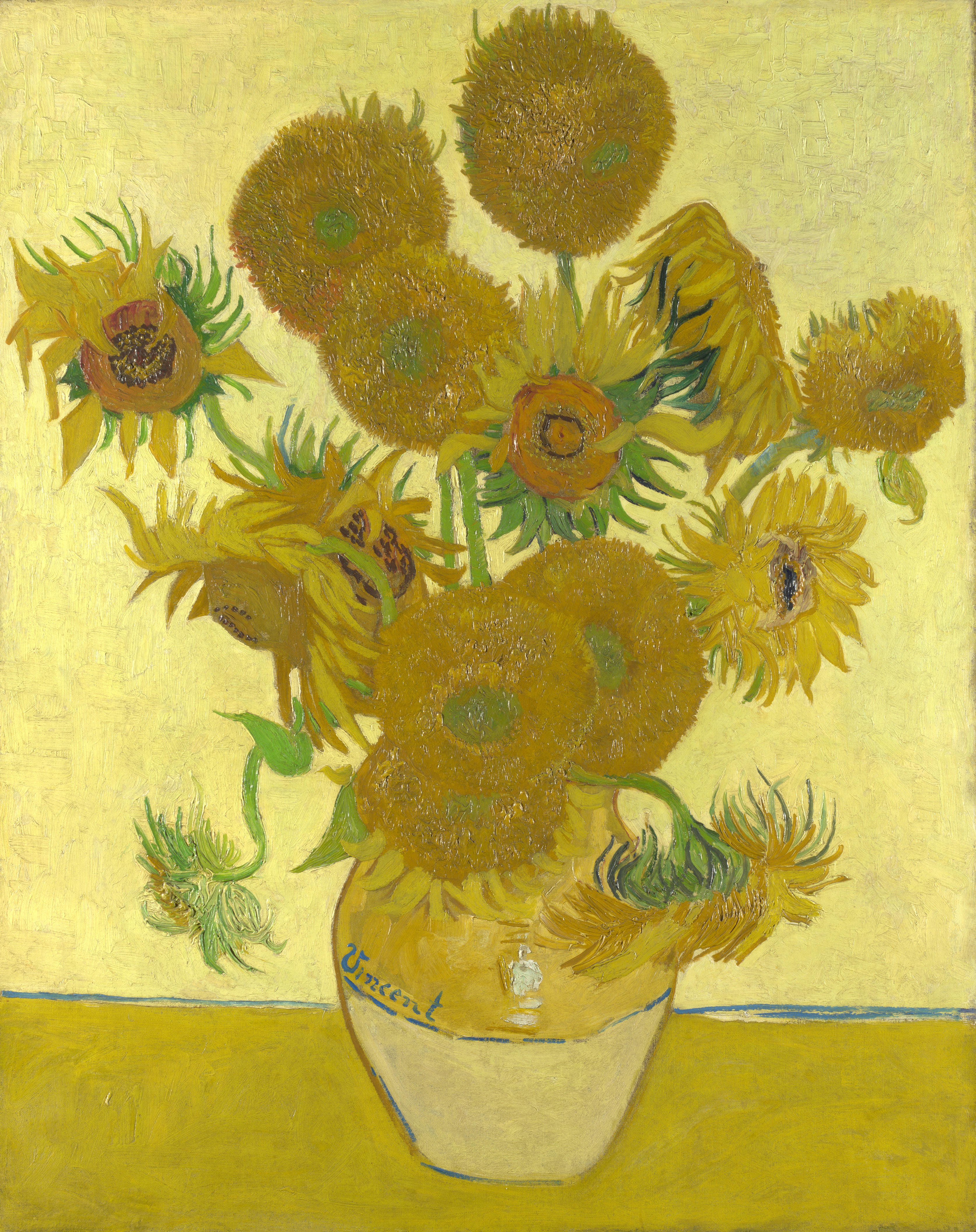
Perhaps I’m being too negative. One bad decor decision shouldn’t spoil a perfectly good color. If I had been born in the 19th century, I probably wouldn’t have such negative feelings about light yellow. Back then, buttery soft daffodil shades were all the rage in American and European fashion. “What we consider flattering today is often not what was considered flattering historically,” writes textile historian Leimomi Oakes, who points out that yellow often has the effect of “washing out” a complexion (i.e. making one look pale). “But up until the 1920s, lighter, paler, and less tanned was better. Yellow is often cited as a flattering colour in 19th century fashion literature, when tanning was definitely not the thing.” Back then, it was cool to look consumptive, a little bit wan. Light hues like primrose and jonquil were advised for day dresses, but so were darker, brighter yellows—mustard, lemon, ochre. This also happened to be when synthetic dyes were taking off, which meant there was suddenly a wider range of yellow available to consumers. Before, most yellows came from weld (aka “dyer’s weed”) but in 1818, “chrome yellow” entered the lexicon, thanks to the work of French chemist Louis Nicolas Vauquelin. The pigment was made with lead, so it was hardly healthful, and while it fell out of use relatively quickly, it remains part of our shared iconography thanks to Van Gogh. His series of sunflower paintings—which Gauguin rather sweetly called “completely Vincent”—positively glow with chrome yellow.
Aside from Van Gogh, not that many artists love yellow. Not that many people do, period. Out of the primary colors, people tend to prefer blue and red. I’m guessing this has to do with our sense of disgust; illness is often yellow. Snot, discharge, pus, jaundice, even that gross yellow film that some people get on their tongues. Blue has no such associations, and while blood is red, it doesn’t ooze. We hate things that ooze. Viscosity is a real problem for our repulsion reflex. Even Goethe, who wrote his philosophical treatise, Theory of Colours, back in 1810, admitted that yellow is “extremely liable to contamination, and produces a disagreeable effect if it is sullied.”
Sullied! I can’t think of a better word to describe my feelings about lemon chiffon. If I take a step back and consider the cake, I’m capable of enjoying the color. I love a citrus, I live for spring daffodils, and I can see the appeal of so-called “canary” diamonds. Perhaps I should embrace light yellow, but somehow, I can’t. The associations are too strong.
And it’s not the association between light yellow and illness that gets me heated. It’s the way yellow feels so infantile and feminine. Coquette, if you will. Regressively nostalgic. And deceptively so. Unlike pink, which has been reclaimed as part of high-femme camp, yellow is sneakily regressive. It has plausible deniability—childrens’ retailers would have you believe it’s “gender neutral,” even though we all know it is not—but what screams TRAD louder than a yellow sweater set paired with pearls? Or a yellow flowered Reformation dress with a little milkmaid bodice? Can’t you just imagine Ballerina Farm dressed all in lemon, swanning about her dairy cows, doing pirouettes and blowing air kisses at the camera?
I’m being ridiculous, I know that. A color can’t hurt me, and plenty of radical communists wear lemon chiffon. (Probably, right? I mean I haven’t seen it, but surely some do?) But the thing is: colors can be oppressive. Not in any material way, but in the way that a yellow room might make one nauseated, or in the way that a smell might cause one’s eye to twitch. We’ve all felt that aesthetic disease, that uncanny distaste. And often, it’s a precursor to some larger betrayal.
Bad vibes, if you will.

I wanted to take a minute to say thank you to my paid subscribers. I don’t paywall content because I care deeply about making my work accessible. I believe everyone should be able to access sources of beauty and inspiration, and I want to live by that. But, since we live in a world that requires money for groceries (and more of it, every day, it seems), I do deeply and profoundly appreciate the people who choose to support my work. Thank you. I know each one of your names, and your generosity hasn’t gone unnoticed.
With love,
Katy
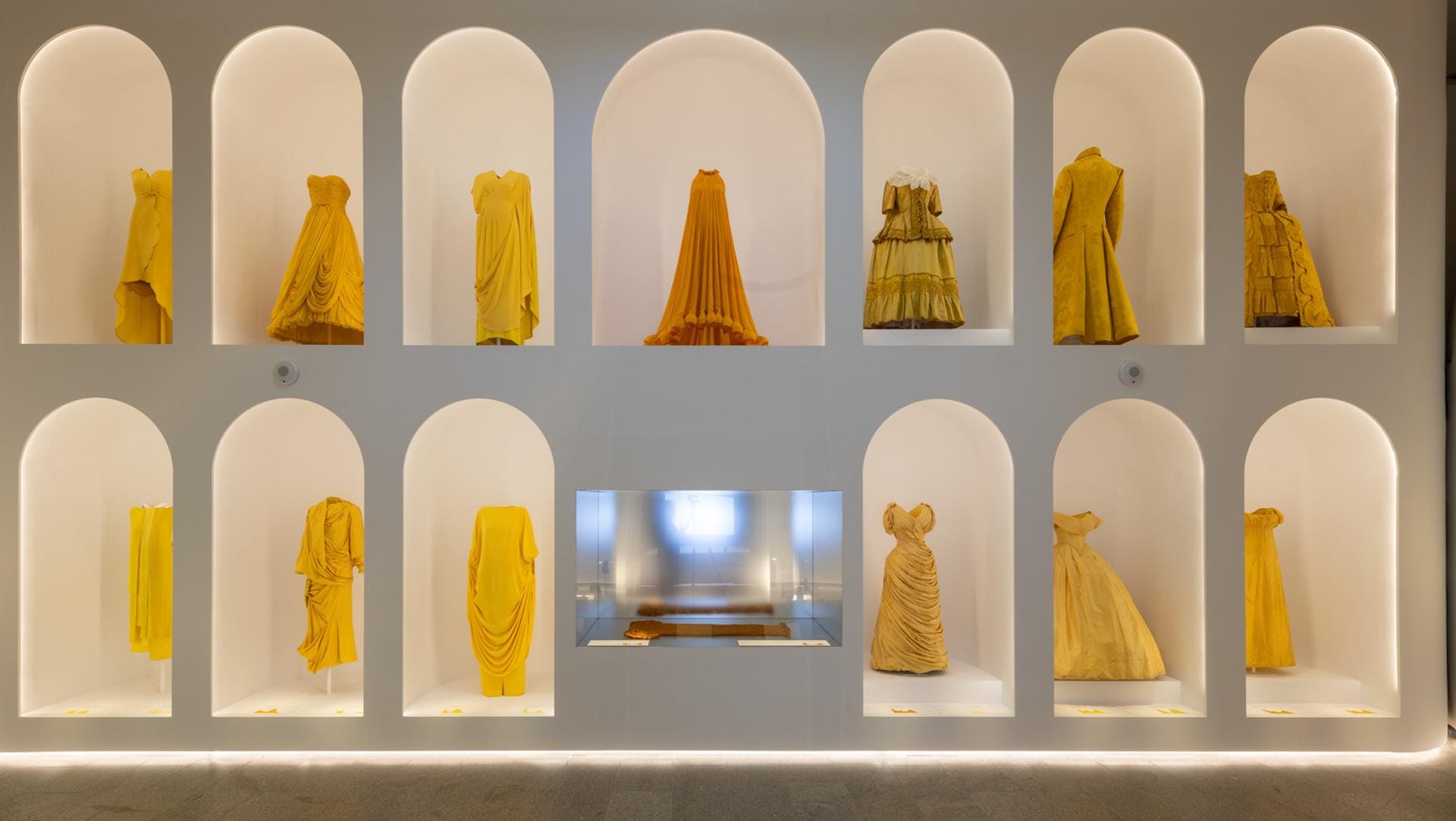
Yellow of any shade in clothing is so stressful for me, but I will say that I had the opportunity to see those dresses at the MET in person and thought they were gorgeous. 😍
Katy, I have just finished reading this piece in my bedroom in my nonno’s apartment in Italy— a space that I haven’t returned to in 17 years.
My mom actually painted over the blue walls a yellow much like this in anticipation of my arrival, and I feel like a baby in a nursery. Previously, this apartment was a run-down ochre colour which had aged terribly, to which she painted white. But this specific, nostalgic yellow is an expression of how my mom thinks I’m a happy and joyous person!
I’m in this time capsule of a room for another two weeks, and whilst I empathize with your viewpoint on yellow (I am more of a roaring, raging orange person!), being in this room that my mom put labour in from sheer excitement of us being reunited (I live on the other side of the world) makes me feel so joyous that we can alchemise and transmute colours in different ways.
As I write this comment, I am also eating a slice of cake for breakfast. My intention for this trip, even with my dismay at the colour, is to absolutely just enjoy being a baby and being in my yellow room!
I also am very happy to see another writer referencing Goethe’s “Theory of Colours” which I am referencing in a piece about the Cyanometer and delving in to the colour blue, when it is available, I would love to have the pleasure of sharing it with you!