Steel your heart for lightest blues
I love you, celeste.
There once was a queen who wanted a bicycle. I like to imagine she was longing for freedom, to feel like she could fly, but I have no way of knowing if that’s true. Let’s pretend anyway. Let’s say Regina Margherita was sick and tired of being an Italian noblewoman, so she spent hours looking for ways to speed past everyone who would tug at her attention, all those hands and eyes and expectant faces. She asked a bicycle-maker to build something for her, a machine that would go fast. He looked at the queen, and in her eyes, he saw the most intense longing for open air. He also saw the color of the sky over Milan. To honor the lady, he made her a speedy set of wheels painted that exact shade—celeste. The color of royal irises, the color of air.
This is the myth attached to Bianchi, a company that has been selling turquoise bicycles since the late 1800s. You might notice that I wrote turquoise not celeste. That’s because the bicycles have changed color over the years, drifting ever more greenward. They’re no longer an atmospheric blue, but a mineral one. It’s still a pretty color for a bicycle, but it’s not the same.
Celeste is a special color, one that I hesitated to write about since it’s so close to verdigris and shares common themes with Marian blue and periwinkle. Plus, I find blues hard to write about without getting sappy; I’m a better writer when I examine objects I find repellent or puzzling. When I love something, my lens gets drippy. Vaseline vision.
But we could all use a little piece of heaven, and that’s what celeste is. The word comes from the Latin caelum, meaning sky. Like the English word “heaven,” cealum could be shifted into an adjective, caelestis, to describe things that were ambrosial or ethereal or otherwise God-like. I think that’s important. Celeste isn’t just a pretty color or an attractive pair of syllables, it’s also a gesture towards the beyond, that great space of awe and presence that resists language. It’s something you know by sight and feeling—the touch of the expanse.
One might be tempted to call celeste a subset of cyan, a variation on the theme of turquoise. But it’s so much more subtle than cyan. That’s a color I associate primarily with frustratedly punching broken printers (because of the whole magenta-cyan-yellow thing) while celeste is lighter and more translucent. Cyan and turquoise both look impenetrable while celeste suggests there’s more to see, if you keep looking. I think celeste is also paler than most sky blues, closer to a wispy powder blue than a shocking azure.
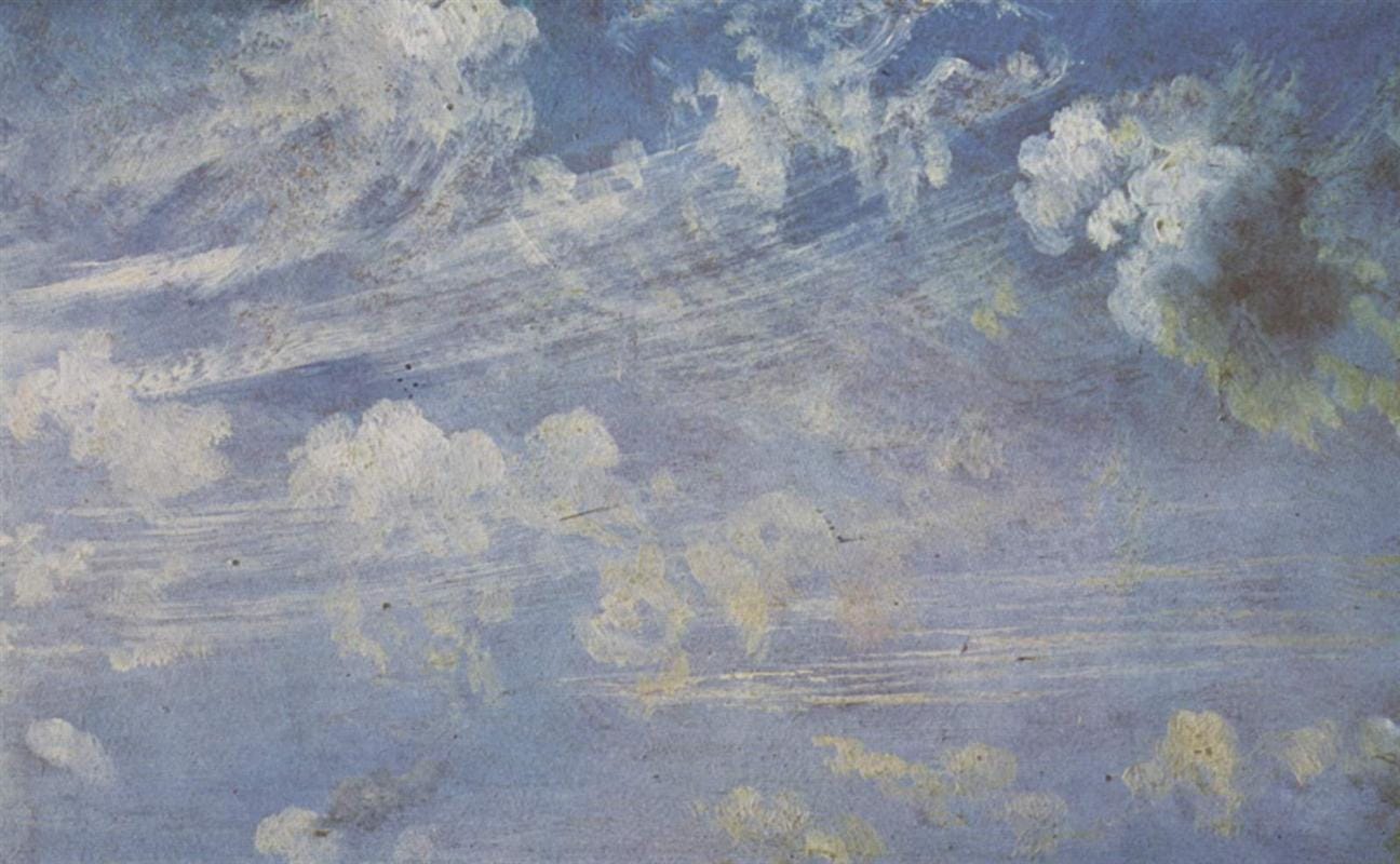
I realize I am showing some local bias here. Where I live, the sky is often obscured by water in the air. Sometimes, when I’m by the sea, I am looking through air that glitters with salt and drifts with fog. Humidity affects the color of the sky, as does your position on the globe, the time of year, the time of day—all those obvious things. So I realize your sky blue could be totally different from mine but I think we can agree it’s a sunrise color. When I think of celeste, I think of a spring sky above muddy fields. I remember how early mornings look in late March—butter yellow, powder blue.
I suppose that’s all celeste is—a romantic version of powder blue. And powder blue is apparently just a prettier way of saying smalt. Back in the 1600s, one way to get blue pigment was to grind up cobalt glass into a very fine powder (i.e. smalt). This powder could be used to both wash and dye clothes. It was also used in oil paints as a cheaper alternative to ultramarine. In its concentrated form, smalt is an intense, loud blue. Over the years, “powder blue” has shifted from referring to a brighter hue to a lighter one, and I don’t really know why. It just has. Colors drift, meanings change, nothing is stable, I guess.
I was going to end this on a note about baby blue for boys and pink for girls, how we’ve got it all backwards, how it was once pink for boys and blue for girls. Unfortunately, that popular debunking might be the real myth, according to Wikipedia. I suggest you trust me on this one, and don’t go read all the various sources that support the blue-for-boys and pink-for-girls trope because you’ll come across a heartbreaking passage about tiny coffins in a St. Petersburg shop window. You’ll be left thinking about boxes lined with satin, soft rose and sky blue.
Image: Spring clouds study, John Constable, 1822 via WikiArt


I am a fan of the mineral Celestite: a most lovely pale blue stone, tinged with periwinkle and occasionally with pale aqua...