
Dove Gray, Part One

The sister dresses demand to be described in SAT words: they are sumptuous, ornate, lavish, pulchritudinous. They glimmer, glisten, glint, gleam. They’re sparkled and spangled and covered in ruffles. If they were in a fairytale, they’d be rivals. But one is so obviously more beautiful than the other. In my opinion, there’s an ugly stepsister and then there’s the Cinderella. She’s the belle of the ball, the loveliest dress of all. And yet, surprisingly, she’s gray. Gunmetal, lead, concrete, industrial gray.
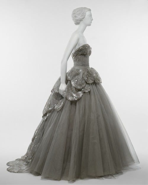
The two gowns, named Junon and Venus, were designed by Christian Dior in 1949, just two years after he launched his first collection. Although some may prefer the brighter hues of Junon—a palette inspired by peacocks, Dior’s favorite bird—I appreciate the subtle sheen of Venus. Inspired by the Botticelli painting, in which a goddess glides in from the sea in a delicate pink shell, the gown is afroth with tulle and backed with bespangled scales. One could call this dress silver, and that’s almost right, but it isn’t quite metallic enough, nor is it warm enough to be champagne or platinum. It’s darker than pearl. It’s unmistakably dove gray.
I have mixed feelings about this color, which is why I wanted to start with an example that was worth the adjectives. Dior’s midcentury evening gowns remain the template for a certain kind of femme glamor but honestly, when I imagine a gray dress, I don’t see it on a red carpet. I’m reminded of the 2010s bridesmaid dresses from J. Crew and BHLDN, the ones that were only a little step up from fast fashion and (in retrospect) indistinguishable from the better-priced ones at David’s Bridal. Back then, I was working at a magazine in Maine, producing specialized content like the Weddings Issue and the Travel Issue. Part of my job was combing through professional wedding photography that had been submitted by the happy couple, trying to decide who could make it into the magazine’s pages. So many of those wedding parties featured lobster and sailing motifs, preppy pretty girls in drab chiffon shivering by the ocean in the shoulder season.

Gray was big. How can a color that basic be big? It’s like saying black is in style—except it isn’t, because black and white always fit somewhere in a wardrobe, but gray shifts. Normally, we think of gray as plain and heathered—that vaguely space-dye polyester sweatsuit, your college boyfriend’s ratty gym t-shirt. It’s a color we associate with uniforms and uniformity. You could imagine an all-gray ensemble on a prisoner or a patient, a corporate-employed cleaner or a military grunt. Undyed wool can be gray, which is why it feels like such a sensible color for the penitent to don; for centuries, the cloudy color was associated with a rather dour strain of Christianity. In a wonderful 2020 piece on gray, Manjima Bhattacharjya makes a strong argument for the association of gray with acts of labor:
If world history had a colour, it would probably be grey. Industrialisation and war, the palette of Picasso’s Guernica and Whistler’s grim landscapes. It has also been the colour associated with worker bees of every economic phase. Whether it was the grisettes, factory girls dressed in grey in 19th century Paris; or the quintessential ‘man in a gray flannel suit’ from the 1950s America, slogging every day to get his family and the country out of the Great Depression; or one of the multitude of software fellas in grey t-shirts and tracks somewhere in the world — the colour grey has belonged to the worker that drives the economic engine of the moment.
Gray can be a slog, but there’s another side to the mercurial color, one that Dior captured handily in his Venus. There’s a certain grace to gray, a sense of subtle elegance and charm. In Victorian times, wearing gray was one way to perform grief. According to an etiquette book from the time: “The discarding of mourning should be effected gradually. It shocks persons of good taste to see a light-hearted widow at once jump into colors from deep black downing as though she had been counting the hours. If black is to be dispensed with, let it be slowly and gracefully, marked by quiet unobtrusiveness.”
Discretion has its charms, particularly when it comes to matters of design and dress. It’s not a vivid hue, but the lack of saturation means you’ll look at gray fabric even more closely. Quality becomes apparent with gray, and natural fibers tend to wear it best. Gray polyester looks tragic and cheap, but gray silk shines with refinement. Even gray wool can feel special when it's been spun and woven with care.
Of course, there isn’t just one shade of gray. There’s dark grays (charcoal and Payne’s gray and Marengo), light grays (silver and pearl and mink), and colorful grays (slate blue, heather, sage). I’d argue that dove gray is the most iconic of them all, for it sits squarely in the middle of the paint chip gradient. It’s of medium darkness with only a smidge of color (yellow or brown, never blue or red). If you spend a lot of time looking at birds, as I do, you’ll probably be familiar with the distinct but dull coloration of the mourning dove. Unlike their pidgeon cousins, doves don’t have any shocking purple-green iridescence or dramatic black stripes. Their feathers change hue, but the range is constrained. There’s brown, white, the occasional hint of pretty, rosy mauve, and so much ashen gray.

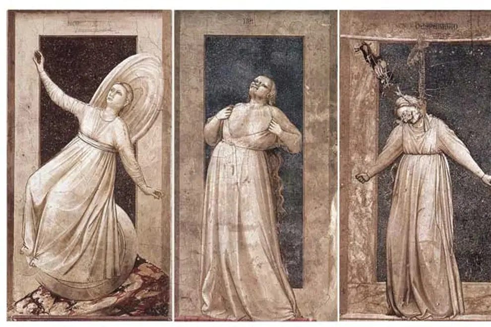
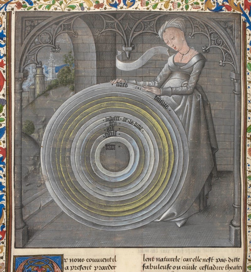
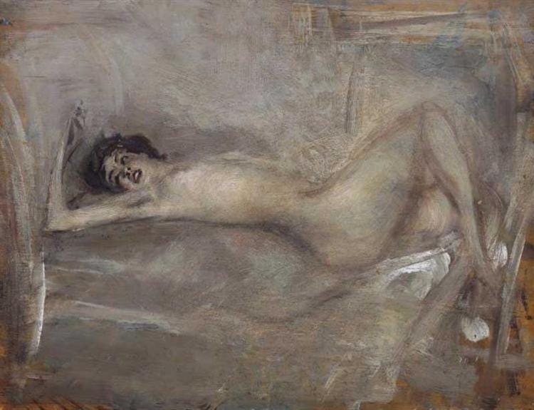
Perhaps that’s the other name I’d accept for this color: ash. It’s cinereous, the color of burnt offerings and dry smoke. It’s a protestant shade, a little too concerned with modesty. But it’s precisely this quality that allows grayscale drawings and paintings to advertise the artist's brilliance and skill. Like a ballerina moving slowly and purposefully across the stage, all-gray works must do a lot with a little in order to capture any of our attention. One technique, called grisaille (from the French gris, i.e. gray) became popular during the early Renaissance, particularly with painters looking to depict architectural forms. Giotto was an early adopter. In the Scrovegni Chapel in Padua (c. 1305), the Italian artist used exclusively gray tones in his depiction of allegorical figures representing seven virtues and seven vices. As you might expect, I find the vices more interesting, and not only because sin is exciting. The virtues are static, statuesque, calm, and composed—impossibly so. They’re untouchable, while the vices are so very human.
Giotto didn’t choose the notorious seven deadly sins for his frescos; he made his own list of failures, which included Despair, Infidelity, Envy, Injustice, Folly, Inconstancy, and Anger. The figures, robed in gray and expertly contorted, are subtle and powerful. Arts writer Tom Lubbock calls them “studies in self-destruction.” They are not “heroes or rebels or charmers” but instead “helpless, raging creatures… Their deep damage is only doing to themselves.” They are symbols of the ways we torture ourselves, how we break our own hearts and poison our own minds. How we fail to rise above.
Following Giotto’s lead, Renaissance artists from all over Europe began employing a dun palette. Not only was it cheaper than splurging for pigments made with lapis lazuli (ultramarine) or cinnabar (vermillion) but it was also a way to imitate carved sculptures. Rather than pay for low-relief carvings on church walls, one could simply paint a trompe l’oeil version. During the 14th century, grisaille began to appear in manuscript illumination, but in this context, it wasn’t the budget option. Wealthy patrons commissioned all-gray pages in their prayer books as a way to “to indicate the manuscript’s status as a luxury product.” According to an article I found on the British Library’s Medieval Manuscripts Blog, it’s possible that the entire grisaille trend was inspired by “an attempted ban on the use of color in stained-glass painting made by the Cistercian Order” in the 12th century. According to this timeline, gray rose windows came first, then frescos, then manuscripts. They didn’t all signify the same things, but all these artistic forms seemed to sprung from the same chromophobic seeds. Color was dangerous—too earthly, too joyful, too intense, too tempting. Gray, in contrast, showed restraint and the ability to control oneself.
Whether it’s soft and light as a feather or hard and cold as granite, gray signifies restriction. Sometimes, the boundaries imposed on an art form can lead to far greater creativity, for limits often function as challenges, inserting a problem to be solved into the process of making. But when the ambition falls short, as it does with so many gray dresses and gray paintings, the project lands with a thud. Plainness can be the point, but when there’s nothing but sparsity and stripped-down sobriety, it’s hard to stay interested. Gray asks for genius to rise to the occasion or, if that’s not possible, it needs to be left quietly alone to coo its own lullaby.
This is part one of a series. Next time, I’ll be writing about the horrors and heartbreak of gray.
"Color was dangerous—too earthly, too joyful, too intense, too tempting. Gray, in contrast, showed restraint and the ability to control oneself."
Okay, I'm stretching the metaphor, but this calls to mind not only the transition from black-and-white to color film, but also the way filmmakers have put the contrast between the two to creative use, eg The Wizard of Oz, or Pleasantville, say. Nowadays, when something is shot on black-and-white (shades of gray, really), the impact is calculated and spellbinding, eg Ripley, The Artist, or L'avventura.
It's hard for me to look at the photo of Dior's Venus dress and convince myself it's not shot in black-and-white. Unlike grisaille or oil paintings or pencil sketches or stone carvings-- film is different. To our modern sensibility, gray film is old-timey, while color coincides with modernity. Black-and-white photos connote a bygone, but specific time period (late 1800s - mid 1900s).
I had the pleasure of wasting time on YouTube this weekend watching some of those old Lumiere films from 128 years ago that have since been colorized. Seeing photos of Civil War soldiers or high society Parisians in black-and-white is distancing-- these strangers may as well be 300 years long buried. But seen in crystal-clear color, the immediacy was moving-- I felt a connection through time. They were no longer abstractions, but came to life. It was awe-inspiring, truly.
In this respect, gray gains richness when color is present. This certainly seems to be the case (to my eyes anyway) in some of the photos you shared this time. It doesn't take more than a stamp of red or a swirl of blue to make the grays more interesting.
Thanks for another awesome read! I always learn something from your essays : )
😍