A few months ago, I wrote an essay about Dove Gray, with the intention of writing a follow-up, to be published soon after. Instead, I published pieces about shades of blue, brown, and red, with no mention of the promised gray. I was stalling. I was stalling because for me, and many other people, gray is the color of depression. As someone who has suffered from that illness in the past (I’m medicated now and feel better, thanks), it can be difficult to write and think about the depressive state. It’s slippery and distasteful. It doesn’t lend itself to good, precise prose. I tend to describe my depression in metaphors—it comes on like a wave, it drowns me, it buries me underground, it takes away my light, it immerses me in the boundless, despairing, quiet-yet-chattering, numb and unkind world of anhedonia. It deprives; it undoes. It sucks.
But I promised to do this, and so I will. When gray isn’t being soft and feathery, when it isn’t subtle and elegant, gray is depressive. Depression is gray. Why is it gray? Enter our first example, the little Zoloft blob.
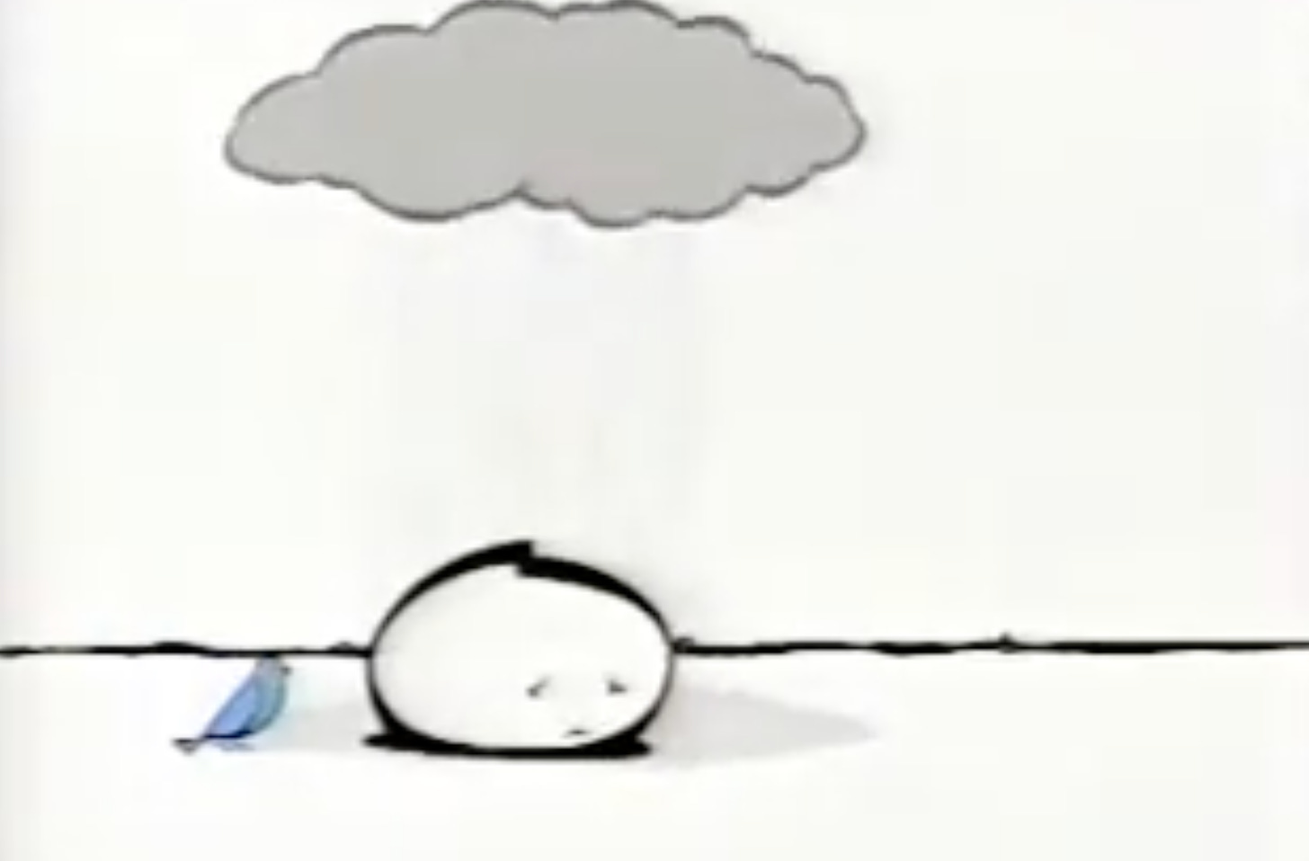
In the early 2000s, the pharmaceutical company Pfizer started running a series of ads that depicted a little bubble creature, a sad monochrome blob. This genderless creature had a tiny face, with a small curved mouth, set in a frown, and sad curved eyebrows, indicating shame. The world around the blob is black-and-white, save for the bluebird that sits nearby, cheerfully witnessing the pain. At the start of the commercial, the little fellow lives below a cartoon gray cloud, one that follows them alone. It’s their depression, we’re meant to understand, and with the help of a pill, this depression can lift. They can see the bluebird, feel the grass, bounce along the ground happily, passing yellow flowers on their way, alive again to the beauty of the world. In a history of the Zoloft blob, MEL writer Lauren Vinopal praises the effectiveness of the “melancholy doodle” and reveals that it was designed by a Daria animator (checks out). “As a teenager, I had never heard of chemical imbalances or depression, but the Sad Blob broke it down concisely and in a way that helped me understand that mental health was an important part of my overall health,” writes Vinopal. “The Sad Blob gave many people something to point to and say, ‘That’s exactly how I feel.’”
Depression is gray. It’s not black or white. White light contains all the colors; it illuminates. Darkness has its own appeal—a black night has secrets, insects buzzing, bats using their sonar, leaves rustling and cars in the distance. Black is a world of its own, a place of nothingness and thus, a space of infinite possibility. Gray isn’t nothing. It’s present, it’s flat, it gives something to the viewer, and that something can be beautiful (as I noted in the first part of this essay) but it can also be, when lacking texture, an endless wall. Black is a hole; gray is a cage.
Žižek, too, saw the silent anguish of gray. In his book, Looking Awry, the philosopher uses an obscure science fiction novella, "The Unpleasant Profession of Jonathan Hoag", to help illustrate his point. The story follows an unpleasant amnesiac named Jonathan Hoag as he goes to the doctor, walks down the city street, gets lunch, and visits a lawyer. Throughout it all all, we’re immersed in Hoag’s deeply misanthropic thoughts. He hates children with their rat-like faces (the boys) and their tattletale mouths (the girls). He despises a laborer for his sweaty smell, he sneers at women and turns his nose up at food. In short, he sucks.
But it turns out that this Hoag is only one side of the man. His other personality is an epicurean, an art critic, a lover of all things beautiful and rich and true. However, we only meet this half-Hoag through a pair of detectives, a husband-and-wife team, the Randalls. And we only learn of Hoag’s split selves (and his true nature) towards the end of the story, when he finally reveals his true nature to the Randalls during an otherworldly picnic located on some unearthly plane. Shocked and confused, the Randalls go to drive home to the regular world, their regular lives. Hoag warns them not to open their car windows, not for any reason. But of course, they can’t help but look at the world outside: “Nothing but a grey and formless mist, pulsing slowly as if with inchoate life.”
For Žižek, this dull threat is the intrusion of the Real. The Real, when it is capitalized like that, refers to everything we’re born into but lose sight of when we learn to talk—it’s the pre-language world of nature. The grayness represents a concept that resists categorization and symbolisation. It doesn’t even like being shuttered into the metaphor of grayness. We’re not supposed to seek The Real and we’re certainly not supposed to hang out in that space. Our human minds aren’t designed to handle its callousness.
It’s fitting, then, that dove gray is the color of institutions, of plastic medical beds and hospital chairs, of locker rooms and prisons. Gray is the color of uniforms for the subjects meant to go unseen—grunt soldiers, cannon fodder, janitorial staff, wardens, the incarcerated. On a practical level, this is because much of the dust and dross we pick up tends to be gray. I don’t mean to smear gray as a dingy color (though it can be that) but to recognize the practical reasons we use it for certain cloths and surfaces. Gray is forgiving of a little age, a little degradation. And on a symbolic level, gray is also used for these spaces because it is an unobtrusive color. You’re not invited to look closer at these people and places. Your eye is supposed to glide, easily, over and past them.
Is that why designers of the 2000s and 2010s seemed to be so gray-focused? Was it all just an attempt to avoid detection by the big bads of the 21st century? (The Great Recession, the right-wing fear-mongering, the racist revival/reveal, all those American cultural fuck-ups that defined the decades.) Or did they actually believe that gray was the new black, the new classic that would, this time, finally stick around?
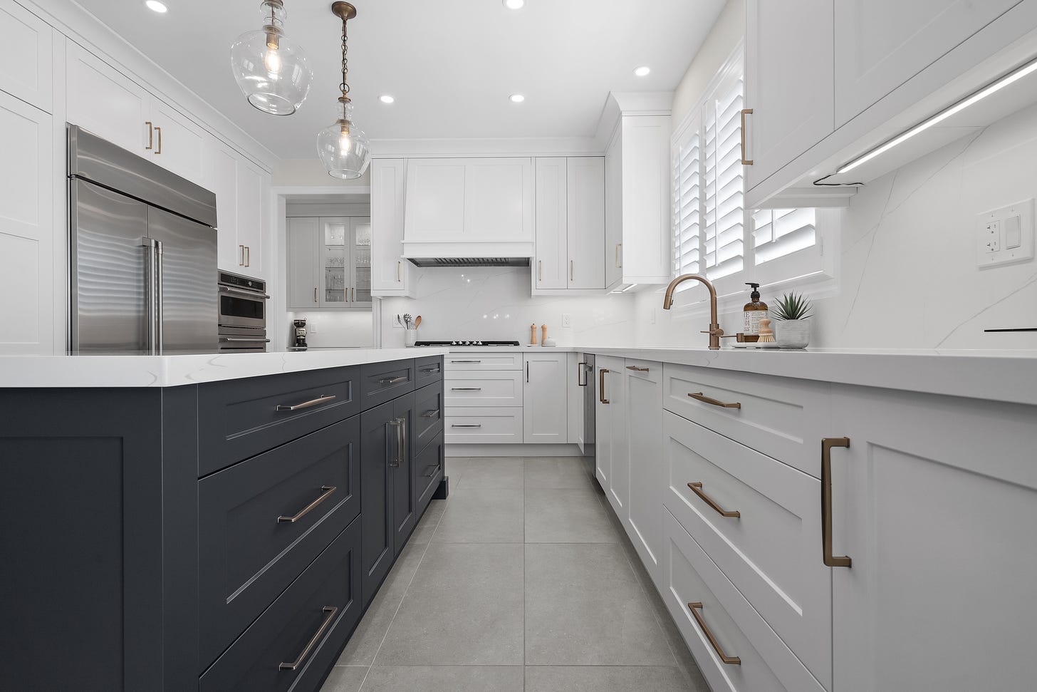
For a long, strange moment, gray was everywhere. I remember my friend telling me that she only wanted to wear gray sweaters every day because, “it makes me feel like a fuzzy mouse.” It was easy for her to find these knits, since all the mall stores seemed to have an endless supply of charcoal, taupe, mushroom, and dove. New York Magazine published stories about “groutfits” (i.e. all-gray outfits) and landlords everywhere pushed gray-washed oak floors on us renters (or more likely, they chose the fake, linoleum mimics of hardwood for their cheap renovations, plus gray tiles, gray sinks, gray carpeting, and gray paint). At first, I think most of us liked this change. It wasn’t the aspirational Tuscan tan of the late 1990s or the cheesy mauve of the 80s being peddled to us as a neutral. It was something cooler, a little less homey, a little more industrial and techy. It fit with the edison bulbs and the black steel fixtures that became so popular. Gray, despite all its flaws, does telegraph a certain chill. It wasn’t as try-hard as black paint nor was it as demanding as white. Gray was a compromise, perfect for a generation that had gotten used to constantly lowering our expectations.
Up until recently, I had assumed that dove gray receded in popularity when Millennial pink took over as the neutral du jour, but then came the great gray panic of 2020. It all started with a non-peer-reviewed study from the Science Museum Group Collection that analyzed photographs of objects from UK museums. After crunching the colors on 7,000 images, researchers found that there had been a notable uptick in gray items over the past century. They attributed this change, at least in part, to the widespread use of plastic. On TikTok, the study began circulating as evidence that we, as a globalized culture, had lost our joy, our individuality, our vitality.
Magazines and newspapers began reporting on the issue: “Everything has turned grey – cars, clothes, kitchens, carpets. I can’t take it any more,” proclaimed Guardian columnist Adrian Chiles. “The World Is Literally Getting Less Colorful, New Analysis Finds,” read another headline. “Is the Color Gray Taking Over the World?” asked Architectural Digest. The last article is the most measured, and I don’t just say that because it quotes me. Writer Loney Abrams errs on the side of skepticism and gray neutrality, arguing that “even if the percentage of gray objects has increased, the number of colorful objects has also increased exponentially. Let’s also emphasize that we are talking about consumer objects, and not the world as a whole.” During my phone call with Abrams, I tried to point out how little it all matters—how gray isn’t going to consume us, but consumerism itself might. I suggested that maybe the performative freakout over the increase in gray objects might be a stand-in for other fears. Maybe the problem isn’t what we’re buying, but that we’re still buying.
That was a few years ago, and I wonder if I was too blasé in my interview, too quick to dismiss some genuine fear of gray. I recently learned about the “gray goo scenario,” which I’ll let Wikipedia describe:
Gray goo (also spelled as grey goo) is a hypothetical global catastrophic scenario involving molecular nanotechnology in which out-of-control self-replicating machines consume all biomass (and perhaps also everything else) on Earth while building many more of themselves, a scenario that has been called ecophagy (the literal consumption of the ecosystem). The original idea assumed machines were designed to have this capability, while popularizations have assumed that machines might somehow gain this capability by accident… Gray goo is a useful construct for considering low-probability, high-impact outcomes from emerging technologies. Thus, it is a useful tool in the ethics of technology. Daniel A. Vallero applied it as a worst-case scenario thought experiment for technologists contemplating possible risks from advancing a technology.
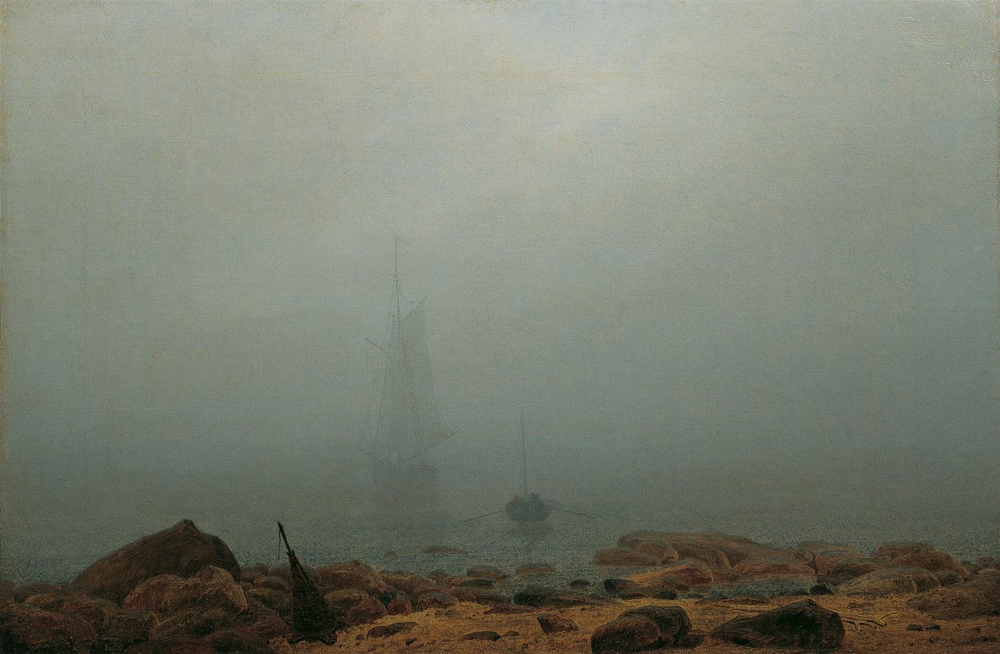
It can’t be a coincidence that The Real is gray, that earth-eating devices are gray, that fog is gray. And maybe that’s the true root of all this fear, maybe we have a primal, instinctual fear of losing our sight to airborne water particles. There is something sinister about a mist that rolls towards you, something deeply troubling about the idea that one is about to be swallowed by a mindless force, one that cares nothing for your human heart, your desperate red blood. It’s chilling, and that’s another metaphoric word that simply works because it’s correct. A body is chilled in temperature in the fog, a mind is chilled, slowed, and infected with the grayness of depression.
Fortunately, there are other types of technology, other ways of being and building that don't rely on endless progress. We’ve been building lighthouses since the first century. They’re simple things, towers with lights on the top, and yet it can neutralize the threat of the gray. A fire, a spark, a candle in the window. Sometimes, that’s all it takes.
Of course, sometimes we need the Zoloft. People are complicated.
Did you, against all odds, enjoy this rambling color story? Consider paying for them. Or even better, buy my book.



i think this might be my favorite color story from you. this was brilliant and beautifully written
This was so exceptional 🤍