

A thin place green
Finding new meaning in an old standby (a more discursive post than normal)

A few years back, it became very fashionable to “smudge” one’s house with burning bundles of sage. It was, according to shopkeepers and lifestyle writers, a way to purify your space. The muddy gray smoke drifted aimlessly though the homes of my friends, perfuming the air with an acrid scent. In lieu of prayer or speaking one’s hopes aloud, we pretended that the sage could do it all. Cleanse, dispel, uplift, invite. Fix our problems, stabilize our homes.
As you may already know, smudging with sage is now widely frowned upon, a closed practice sacred to a culture that is not my own. This is a good and useful shift; it’s worth knowing how to supplicate in a respectful manner. Plus, it turned out to be ecologically irresponsible, since the craze for sage resulted in the plant being harvested at a rate that is damaging to the desert landscape. And anyway, the yawning void at the heart of millennial culture, the secular yearning for meaning, the sad and listless consumerism that plagues so many of us—that appetite can’t be sated with twine and leaves. And while I’m sure some people were buying the bundles for the trend points, some of us really were looking for a blessing. I smudged because I wanted to be cured. I was hungry for a spiritual practice and at the time, I was willing to eat whatever was placed in front of me, regardless of whether it was mine to consume.
I don’t feel terribly guilty about burning sage—I’ve committed far worse sins in my 36 years on earth. I think it’s enough that I’ve quit the habit and dedicated myself to collecting candles instead. But I do find myself thinking often about sage (the color, the plant, the oddly comforting vibe of sage) now that I’ve moved across the country and into the desert. Here, sage is everywhere and nowhere. By this I mean: the color is all around me. But the plant? I grew it more easily in Maine.
Let’s define this holy, soft, dated color. Sage is a shade of green. It has yellow in it, and blue, and plenty of gray. The yellow and gray can read as brown, but if I were mixing paints, I wouldn’t use walnut or umber or any other strong, warm brown. It needs more light, perhaps some white. Sage is pale, silvery, but not quite as blue as glaucous or as saturated as celadon. Both those greens, while close to sage, appear more wet, waxy, polished, oceanic, glazed. Sage wants to be matte, maybe even a little dry and papery. At its best, sage has a feathery textural quality, like lambs’ ear or mullein leaves. At its worst, sage is flat, dull, scuffed wall paint from a 90’s “Tuscan” kitchen, an accent to offset all that beige, taupe, and buttery yellow. It’s not pistachio (a more cheerful, punchy green) nor is it avocado (browner, 70s vibes). It’s certainly not mint and you’d have to be colorblind to mix it up with “neo-mint”, a mid-2010s micro-trend that never really took off.
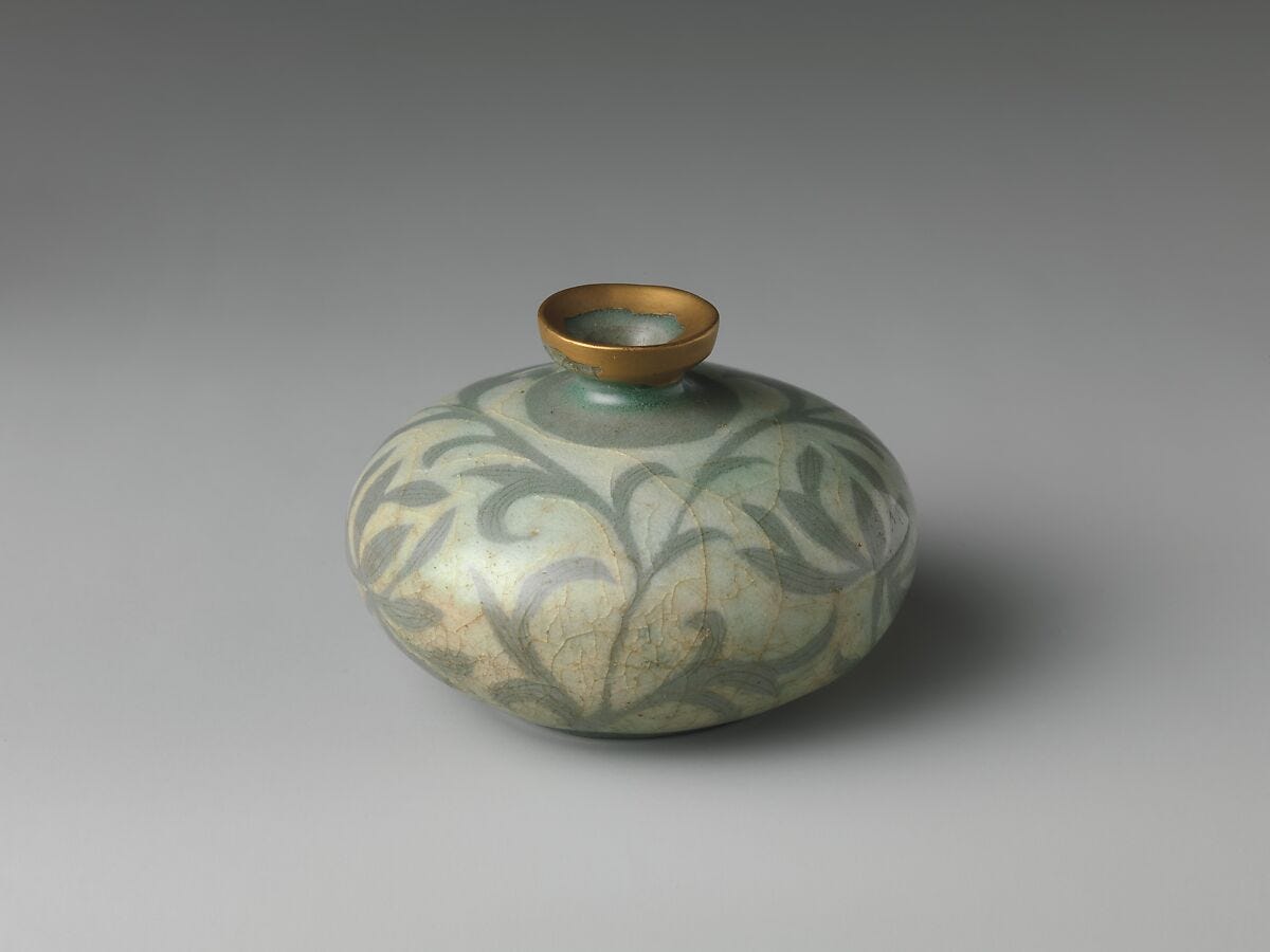
I’ve written about a few different light greens over the years. I mentioned both celadon and glaucous in the above paragraph, for those are the two closest to sage, but I’ve also written about verdigris, chartreuse, and eu de Nil. I actually debated whether it was worth writing about sage green, since I’ve researched so many vague greens over the years, I thought perhaps there was nothing more to say. And maybe, when it comes to historic color trends, there really isn’t much more to add. Eu de Nil covered light green fashion pretty well, and glaucous goes into the (contested) linguistic origin of green. Verdigris describes the emotional associations that swirl around copper-based, faded, broken pigments, and celadon is a tight little tale of ceramic secrecy. All those hues have had their moments in the sun, so what makes sage different?
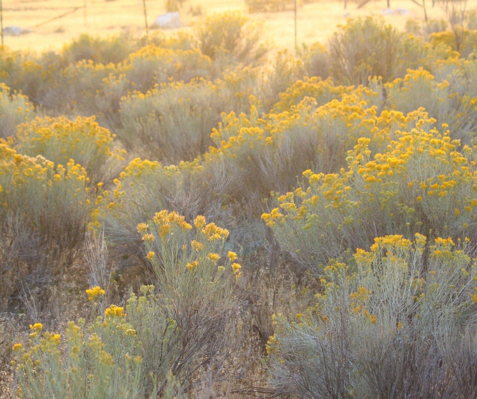
Firstly, there’s the obvious: sage is different to me. It’s taken on a new dimension since moving to New Mexico, and I think that’s worth exploring. But sage also feels distinct in how it has been used. It’s a color that I see often in fabric, wallpaper, paint, and dishware. It’s a common consumer goods color, and as someone who is fascinated by both goods and consumerism, that makes it worth thinking about. According to Elle Decor, sage green is “nature’s neutral.” This makes it a good color for interiors, since it pairs well with the other neutrals: eggshell, taupe, linen, dove gray… even gunmetal and steel look good with sage. Living in New Mexico, sage is a huge part of the landscape colorway, which makes it appear neutral, unremarkable, common. This was less true in Maine, where greens tended towards jungle bright or pine dark, but sage is everywhere here, as ubiquitous as the iron-pink dust and celeste blue skies. So many of the scrubby plants that grow alongside the trails of Santa Fe have that silvery tone to their leaves, that slightly yellowish warmth, that strange fuzziness. Even the cactuses have it, if you look beyond their obvious white spines. I’ve been deceived so many times already, thinking in my hubris that I could pick a prickly pear fruit if I simply avoided the big white needles, not remembering the real danger—all those tiny hairs that embed in your thumb and itch and sting until you finally suck them out. These are called glochids, and they grow in tufts, and they (along with goat heads) have become the bane of my epidermis and existence.
Then there’s the duo of rabbitbrush and sagebrush, two bushy plants that grow together and seem to be absolutely everywhere. My mother told me about Chamisa (aka rabbitbrush), singing the praises of its prolific golden flowers, which grow in large bunches and cover the roadside with clouds of saffron. She didn’t mention their smell. I’m not surprised that she forgot—I think she remembers only the best things about her life in New Mexico, none of the hardships or discomforts. Because while sagebrush is delightful, iconic, etc. Chamisa is something else. It’s a weed and it stinks like one. Worse than most weeds, actually. Its blossoms earned it the species name “nauseosa”. One source I found said that the scent is reminiscent of pineapples or rubber, though I think it smells like dog piss. Or maybe that’s just the association born from the color. Either way, its pungent.
The memory of all these Southwestern brushes was somewhere inside my brain, lodged there from when I lived here last, but it had been overgrown, replaced with newer, fresher scenes of greener grass and livelier woods. And, more insidiously, where I once housed my “New Mexico” memories, I now have a collection of half-recalled fragments, composite visions colored by inherited nostalgia. It’s my mom’s fault; when I was a teenager, she frequently sang the praises of this region, talking about it with the kind of reverence usually reserved for obscenely attractive men or holy texts. Our house in Massachusetts was decorated with pictures of New Mexico, pots from New Mexico, rugs purchased in New Mexico, and potted plants that once thrived in New Mexico. They struggled in Massachusetts, much like my family, but they kept on.
It wasn’t until years later that I realized this stylistic affectation wasn’t unique to my family. So-called “Santa Fe Style” was a huge trend in the 1990s, supposedly sparked by a posthumous exhibition of Georgia O’Keeffe’s works that traveled around the United States, starting in 1987. “O’Keeffe was not alone in her love for the Southwest’s evocative mélange of Old West individualism and adventure, ancient Native American and Spanish cultures, and a frisson of New Age spirituality,” explains Pantone: The 20th Century in Color. As the Sun Belt population exploded and the Rust Belt declined, Southwest style became more popular. Even European designers embraced the colors, textures, and décor of New Mexico, installing terracotta pots in London flats and laying down Navajo rugs in Parisian brownstones. “The mauve-inflected tones of desert earth, adobe, and high Sierra sunsets were suddenly everywhere. Just as America went Avocado green in the ‘70s, it turned mauve in the ‘80s.” Other colors included in Pantone’s analysis of this design moment include “rich brown, pink sandstone, adobe red, and sage green… dreamy lavenders lend a sense of historical and spiritual depth.”
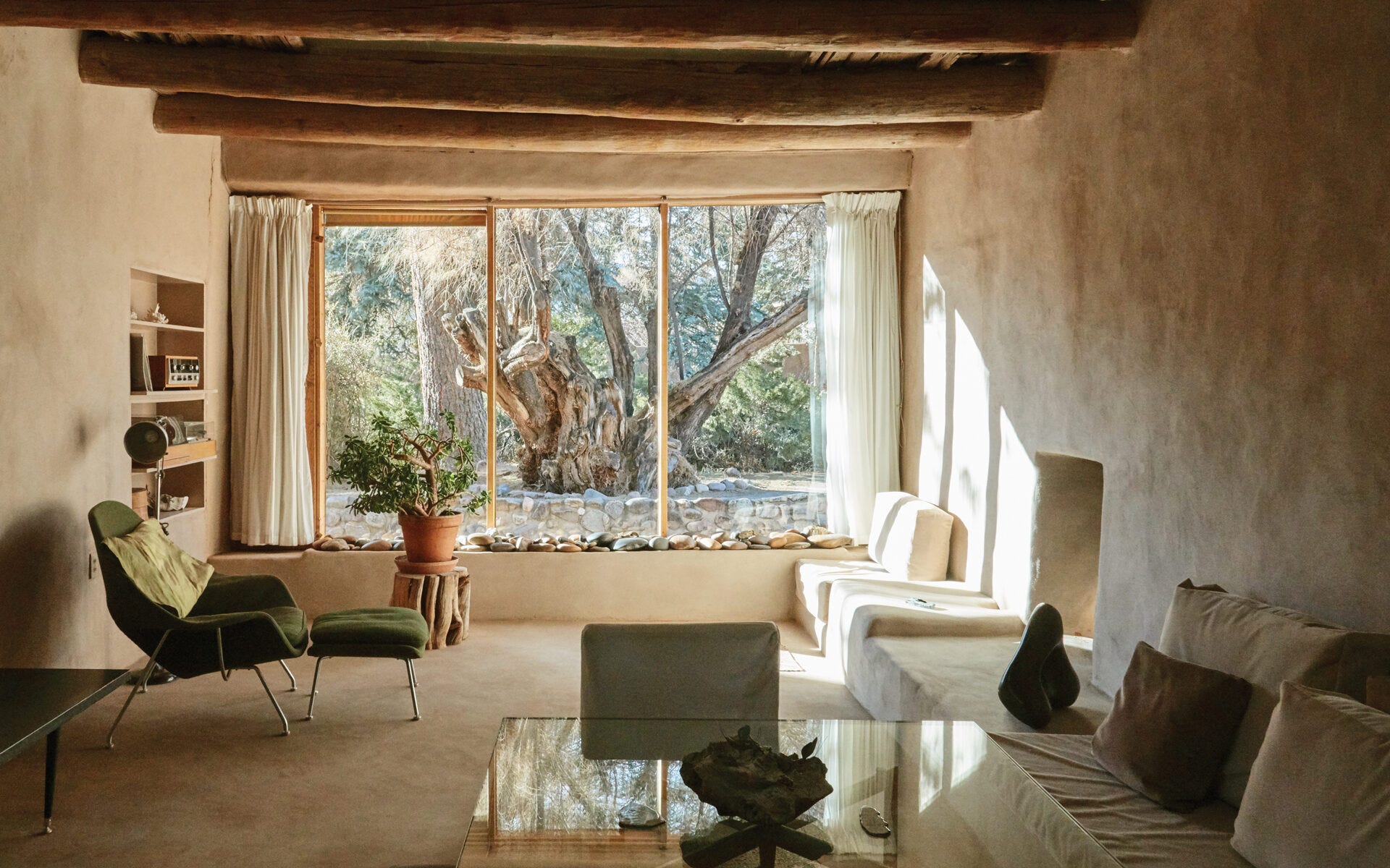
Another popular trend 1990s design trend was something called “urban Zen”. This was the interiors version of Calvin Klein minimalism, and while the shapes were pared back, the lines were clean, the look was rather more rigid, it did use a very similar color palette to the overstuffed and rustic Southwestern style. Lavender and sage were two colors that played a huge role in these seemingly opposite looks. To this day, when I see a plain light purple sheath, I think of Natasha’s impeccable dress in season three of Sex and the City, and when I see a Macha-green wall, I’m brought right back to my first therapists’ office in suburban Massachusetts. Late 90s minimalism gave way eventually to the gray washed interiors of the early 2000s, but for a brief moment, warm beige, sage green, and soft purple felt like the most sophisticated colors one could don.
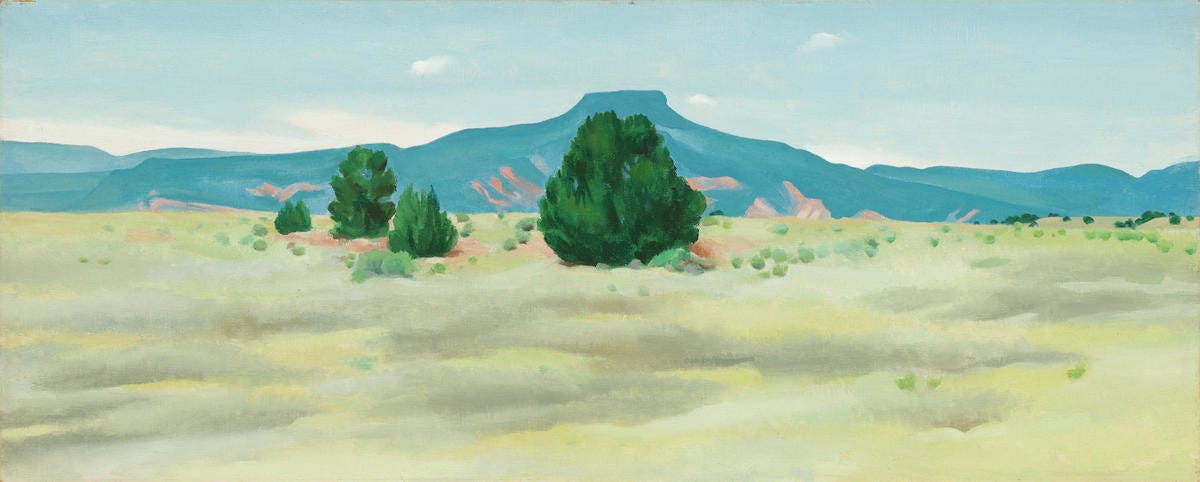
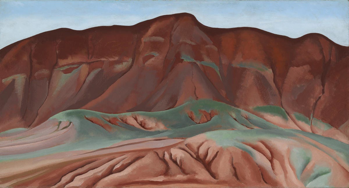
After poring over too many old Ikea catalogues, looking for evidence of mass produced sage green sofas and shelving, I decided to go back to the supposed source. I became interested in what Georgia O’Keeffe said (with her paintbrush or her mouth) about greens, so I set out to find her greenest works. I was surprised to see how many of them were super saturated, rich, bold greens (emerald, spruce, apple). These canvases were painted mainly on the shores of Lake George, though there’s a few from Maine, too. They’re recognizable as O’Keeffe pieces, though some of them could almost be Arthur Dove or Marsden Hartley. They have that roughness to them, the immediacy of more traditionally masculine painters. They’re hers, obviously, and marked with her flexible brilliancy, but I can’t love them quite as fully as her cloud scenes or her floral abstractions.

To find my sage, I had to look at her desert landscapes, the pieces she painted of New Mexico’s black mesa and red rocks. There, you find dream-washed cottonwoods with pale leaves, uprooted shrubs ready to tumble, scrubby junipers, and spikey agave. It amazes me, how assertive these plants are (all those spines and needles!) yet how easily they fade into the background. Their violence is intimate, impossible to see from a distance. With her brush, they become soft—not as velvety as her iris petals or plumply tempting as the cala lilies, but still soft.
According to local legend, O’Keeffe’s beloved Ghost Ranch is a “thin place,” where the boundary wall between our world and others is gossamer thin, unusually porous. Ghosts can come and go; heaven seems close at hand. Writing for the New York Times in 2012, Eric Weiner posited that thin places are where “we’re able to catch glimpses of the divine, or the transcendent, or as I like to think of it, the Infinite Whatever.” Being in a thin place isn’t always pleasant or fun. It's not about finding happiness but rather experiencing a discomforting sense of awe. Weiner quotes religious scholar Mircea Eliade, who wrote that “some parts of space are qualitatively different from others.” In fact, Eliade went much further than this—plus, he prefaced the above quote with his oft-repeated refrain, “for religious man.” In The Sacred and the Profane, this phrase repeats over and over, since he’s differentiating between two types of people: those who are awake to the wonder of the world (religious) and those who deny the presence of spirituality (profane). The profane man “forms himself by a series of denials and refusals, but he continues to be haunted by the realities that he has refused and denied.” The profane man is blind to certain things that the religious man sees clearly. “For religious man, nature is never only ‘natural’; it is always fraught with a religious value. This is easy to understand, for the cosmos is a divine creation; coming from the hands of the gods, the world is impregnated with sacredness.”
It's tempting to lump myself in with the sacred types, the religious believers, the people who see the hand of god in every leaf and pebble. And maybe I do fall into that category, at least a little. But I’m also a profane person, sometimes. I don’t worship, not even at the altar of nature. I often have to work to experience awe, to train my eyes and my heart to appreciate the world in front of me.
I’ve visited Ghost Ranch myself, and although I would like to say I shuddered in that thin place, trembling before the majesty of cliffs and canyons, I didn’t really. I was mostly taken by the rabbits that scamper around, jumping out from under sagebrush and moving full tilt towards their nearest known refuge, cottontails winking bright white as they disappear in the dusk. But thinking about it now, I do find myself frequently falling into a scopophilic trance in New Mexico, lulled by the loveliness of looking into the distance. For you can see far here, farther than anywhere I’ve ever lived before. Your eyes have greater roaming range; they can rest on a snowy mountaintop, miles away. Or they can follow a line of cottonwoods, leaves yellow from the cold, until they fade into a single stripe of golden color, a gilded marker for the river that flows muddily below.
Perhaps that’s how we can experience a thin place in the 21st century. Not as a God-place, but a broadening place. An opening place. You know where else I feel that same distance and calm? On an airplane, zonked out on Ativan, staring at the world as it recedes.
I’ve written before about how blue is the color of distance and longing, and I believe this to be true. Sage isn’t as heavenly as celeste or midnight blue. But it does feel complicated to me, and more than a little thin. Sage is an in-between color that fades into the background. A quiet color, a desiccated color that feels neither totally of the earth nor of the sky, neither alive nor dead. It’s the color of so many dormant plants and wintering ecosystems. It’s not the vitamin-rich, chlorophyl-drunk green of tender new leaves or unruly growth. It’s softer, dirtier, less defined and more available.

I keep comparing my memories of Maine to the New Mexican landscape, not because I think one will come up short, but because my understanding of ecology is so deeply inadequate here. After a decade of living in Maine, and almost three decades of living in New England, I had a storage of subconscious knowledge, gained from watching and living, that helped me to orient myself in space and time. Without thinking about it, I could look outside and tell whether it was going to rain or snow, freeze or thaw. I knew which blooms followed which, and which weeds grew near the shore or on the borders of forests. I knew the names of trees, berries, flowers, and mushrooms. But it was more than being able to point out a plant and say the correct syllables. It was a sensory knowing, a wholistic knowledge. I knew with all my senses how to move through the forests and shores of Maine, how to enjoy them, how to read them. And I wasn’t even an expert guide, just a frequent walker and swimmer and climber. I was a gardener and a mother; a person who loved the land for what it offered my family.
Here, everything is different. This is what I wanted, the reason I moved. Yet it’s also disorienting to realize how much deep knowing I’ve left behind. It will take a very long time to learn this landscape in the way I knew that one. No matter how many birding apps I download or plant books I buy, I won’t know the high deserts of the American Southwest until I’ve lived here for many seasons. My face will be wrinkled and creased in new directions by the time I’ve amassed even a fraction of the place-knowledge I had about Maine.
And to think, this knowledge will still be just a fraction of what locals know. I used to think it was sad when people lived their whole life in one place. But truthfully, I’m envious. I admire the wealth of passed-down knowledge that accrues when families stay put and when indigenous people are allowed to live where they have always lived. There’s no substitute for that experience, no way to fake an intergenerational relationship with the land. There’s no shortcut I can take, no product or book I can buy to make up for my transient nature.
Loved this, Katy! My mom was obsessed with sage in that 90s minimalism way, so I’ve only recently learned to appreciate it again. I loved the idea of it as part of the thin place - I think of it as a ghost color, sad and faded.
Oh, your writing is so gorgeous and generous. I love the depth of your analysis. I had an instant memory of that stretch of months in 2010 when everything was in chevron print of a “neo-mint” hue 😂
I have two enormous flowering sage plants in my backyard and I’ve always found the color a bit frosty, like green under ice. Your writing here has me considering that gossamer quality to the green and how different it is from the brighter greens on the apricot tree. Thank you 💚